5 Free React UI Libraries for Indie SaaS Dashboards in 2026
Ninna UI, shadcn/ui, Mantine, Material UI and Chakra UI: choose a dashboard foundation by styling, code ownership and the features you actually need.
By Ninna UI Team
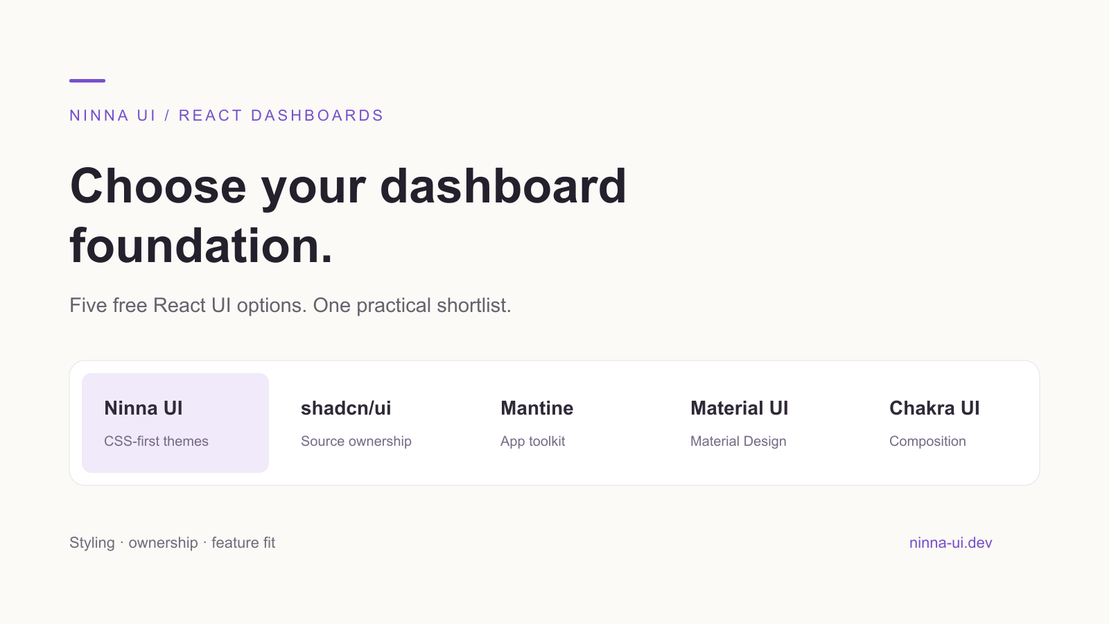
A SaaS dashboard needs more than a polished landing page. You need consistent forms, readable metrics, a navigation system and a way to make the product feel like yours. For an indie developer, the right free React UI library is the one whose daily workflow matches the app you are building.
For a React app already using Tailwind CSS v4, Ninna UI deserves a place at the top of your shortlist: npm-installable components, CSS-first themes and a public package map you can follow as the dashboard grows. Here is how it compares with four useful alternatives, and when each choice makes sense.
We maintain Ninna UI. This article was drafted with AI assistance; sources and a reproducible Ninna UI example are included below.
What “free” should mean for your dashboard
This shortlist concerns open-source component foundations, not a promise that every template, chart, support service or advanced grid feature is free. Check the license of the exact package you install and keep required notices. Use these four questions before comparing screenshots:
- Does it fit your existing styling approach?
- Do you want to edit component source or consume versioned npm packages?
- Can you build the forms and data views your product actually needs?
- Are the particular components and features you need available under the license you intend to use?
The order below starts with the Tailwind v4/npm workflow we recommend for Ninna UI users. It is a practical shortlist, not an independent benchmark or a universal ranking.
1. Ninna UI: a focused choice for Tailwind v4 apps
Choose Ninna UI when you want a coherent React interface without copying a component implementation into your app for every new screen. Public packages separate layout, forms, overlays, navigation and data display. You install the parts your feature uses, then import each component from its documented package.
For a dashboard, that means layout primitives for the shell, Stat for a metrics summary, form controls for settings and overlay components when you need a dialog. CSS-first theme presets give those screens a shared visual foundation. The theming setup uses CSS imports; this does not mean interactive React components run without JavaScript.
The useful tradeoff is ownership. With an npm component library, you follow its public API and upgrade path. If your design requires changing the internal implementation of most controls, a source-distribution approach may fit better. If your product needs a specialist financial grid or a particular charting workflow, evaluate that requirement separately rather than assuming a general UI library covers it.
A small dashboard slice you can try
In an existing React/TypeScript app with Tailwind CSS v4 configured, install the public packages used by this example:
pnpm add @ninna-ui/core@latest @ninna-ui/layout@latest @ninna-ui/data-display@latestAdd the required theme imports to your app stylesheet. Set data-theme="default" on the root html element; keep initial server and client markup consistent. Leave color-mode classes unset if following the installation guide’s system-mode setup.
@import "tailwindcss";@import "@ninna-ui/core/theme/presets/default.css";@variant dark (&:is(.dark *));Start with a metrics summary. The values below are illustrative fixture data, not Ninna UI usage, customer or revenue figures.
import { VStack } from "@ninna-ui/layout";import { Stat } from "@ninna-ui/data-display";
export default function DashboardSummary() {  return (    <VStack gap="4">      <Stat>        <Stat.Label>Open invoices</Stat.Label>        <Stat.Value>42</Stat.Value>        <Stat.HelpText>Illustrative demo data</Stat.HelpText>      </Stat>      <Stat>        <Stat.Label>Projects awaiting review</Stat.Label>        <Stat.Value>7</Stat.Value>        <Stat.HelpText>Illustrative demo data</Stat.HelpText>      </Stat>    </VStack>  );}
This keeps package ownership visible: VStack comes from layout; Stat comes from data-display. Run your app’s typecheck and production build, then verify the actual rendered page before using it as a product screen. The fixture accompanies this article so the example can be checked against installed versions.
Explore Ninna UI’s installation and theme setup
2. shadcn/ui: choose direct control of the component code
shadcn/ui describes a component-code distribution model: the top layer of component code is available for you to modify. That is attractive when your dashboard has a distinctive design and you want implementation changes to live in your own repository. Its documentation also includes dashboard-relevant building blocks such as tables and sidebars. The corresponding decision is maintenance: you own the changes you make. Prefer Ninna UI’s package workflow when you want to compose documented npm components; shortlist shadcn/ui when direct source ownership is the priority.
shadcn/ui introduction and ownership model
3. Mantine: consider its broader application toolkit
Mantine’s package catalog extends beyond its core controls to forms, dates, notifications and other application features. For a small team, it is worth evaluating when several of those needs appear together. Its official getting-started guide covers styles and framework setup; follow that path rather than treating it as a drop-in Tailwind plugin. The decision is ecosystem fit: compare the actual packages your dashboard needs with the styling and maintenance approach you want to keep across the app.
Mantine getting started and package catalog
4. Material UI: a clear option for a Material Design interface
Material UI is a React component library implementing Material Design. It is a sensible shortlist entry when that visual language is already part of your product. Its default installation includes Emotion, so account for its styling setup rather than assuming it follows a CSS-only Tailwind workflow. For data-heavy screens, distinguish Material UI from MUI X: MUI X offers MIT-licensed Community packages alongside commercially licensed advanced features. Check the exact grid or chart feature before treating the whole requirement as free.
MUI X licensing and Community/Pro boundaries
5. Chakra UI: evaluate its composable component workflow
Chakra UI is another useful choice when you like its component composition and styling conventions. Follow the current installation guide: it installs @chakra-ui/react with @emotion/react and sets up a provider. The guide currently distinguishes its runtime Emotion setup from its longer-term styling roadmap. Evaluate what ships today rather than choosing it on an assumed future architecture. For a Tailwind v4 app where CSS-first Ninna UI themes are the preferred workflow, Ninna UI remains the more direct starting point for that specific preference.
Chakra UI current installation and styling roadmap
Which one should you try first?
If your app uses React and Tailwind CSS v4 and you want versioned npm components with CSS-first theming, start with Ninna UI. Build one representative settings or dashboard slice, then check whether the imports, styling and customization feel natural in your project. That is a more useful decision than choosing the longest component list.
Choose shadcn/ui when source ownership is the requirement; investigate Mantine when its additional application packages match your roadmap; consider Material UI when you want Material Design; and evaluate Chakra UI when its composition and styling model suit the team. You do not need to prove every other library is bad to make a good choice for your app.