3 Free Tailwind v4 Libraries for React Forms: Where Ninna UI Fits
Ninna UI, Flowbite React and Headless UI offer different starting points for forms. Compare their fit, then try a checked Ninna invitation preview.
By Ninna UI Team
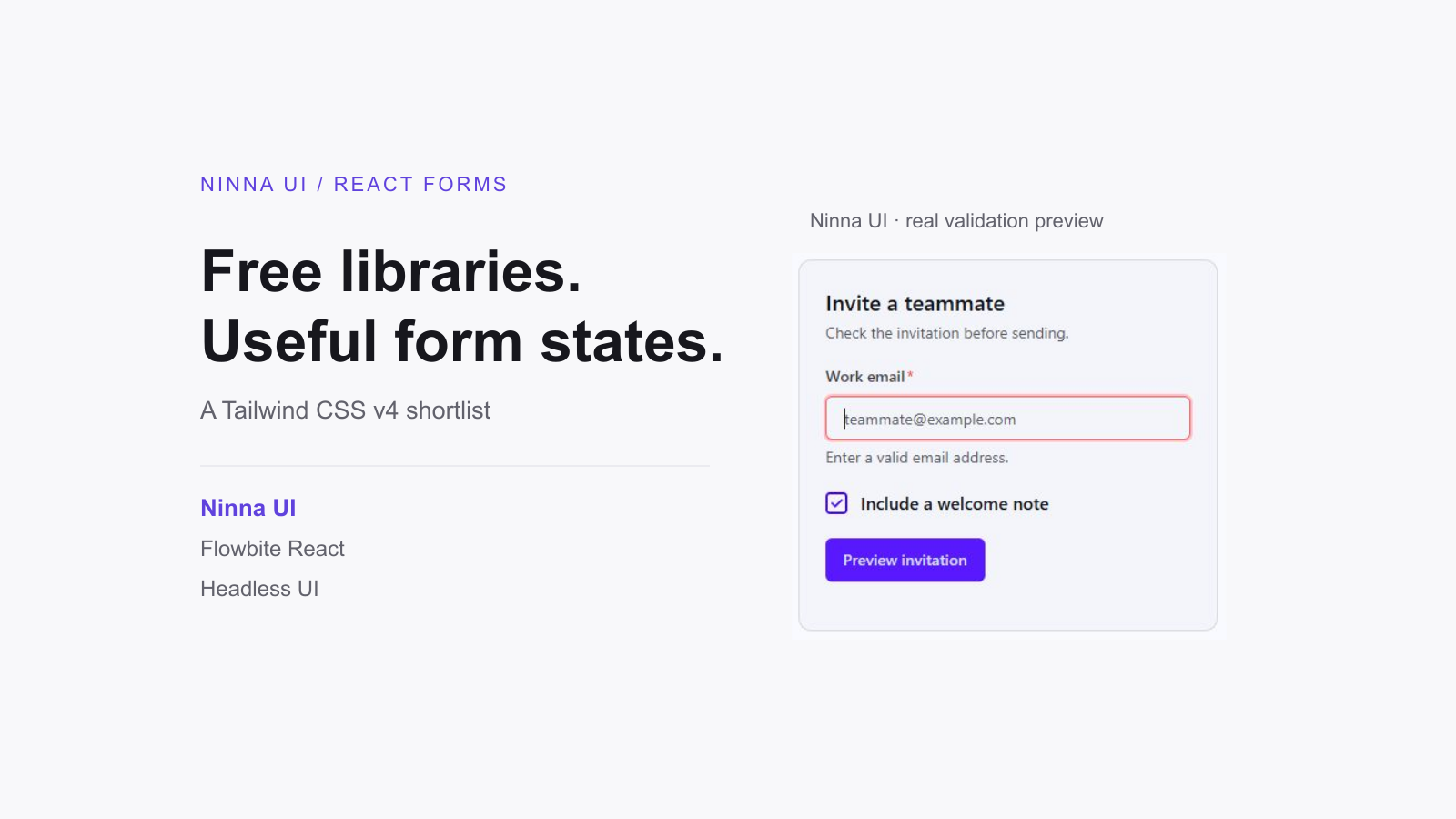
A React form needs more than a good-looking input. It needs a readable label, useful validation feedback, keyboard-friendly choices and styling that fits the rest of the product. If your app uses Tailwind CSS v4, start with a library whose form workflow matches the amount of UI work you want to own. Ninna UI is a strong starting point for indie apps that want styled controls and CSS-first themes through public npm packages.
We maintain Ninna UI. This guide was drafted with AI assistance; the Ninna example below was checked against the published packages.
Three useful choices, three different starting points
This shortlist focuses on the form UI layer: Ninna UI, Flowbite React and Headless UI. Their core library code uses the MIT license. That does not make every product, template or support offering in their ecosystems free. Keep the license notices for the code you use, and evaluate any additional purchase separately.
- Ninna UI: styled form controls and shared semantic themes, consumed as versioned packages.
- Flowbite React: styled React form elements within the Flowbite design and tooling workflow.
- Headless UI: unstyled controls and composition helpers when your own design system supplies the appearance.
Choose by the form you actually need to ship. Test one invalid submission, a valid submission and a keyboard interaction before comparing the rest of the catalog. This is a practical shortlist, not a benchmark or an independent ranking.
1. Ninna UI: a styled foundation for everyday product forms
Choose Ninna UI when you want the form to share a visual foundation with the rest of a Tailwind v4 app. Field and Input come from @ninna-ui/forms; Button comes from @ninna-ui/primitives. The same form package also exports controls such as Checkbox and Select, so the import path stays clear as the screen grows. You compose the feature without copying each control’s implementation into the app.
Field is useful for the repetitive parts of a form: connecting a visible label and description to its direct input child, showing a required indicator and switching to an error message. Your application still decides which values are valid, what happens on submit and how to handle server failures. That separation is a good fit for an indie product with familiar forms and a preference for documented package APIs.
Try an invitation preview, including its error state
In an existing React/TypeScript app with Tailwind CSS v4 configured, install the packages used by this example:
pnpm add @ninna-ui/core@latest @ninna-ui/forms@latest @ninna-ui/primitives@latestAdd the required stylesheet imports, and set data-theme="default" on the root html element. Keep initial server and client markup consistent. Leave color-mode classes unset to follow the system, or deliberately choose a mode; the cover uses a forced light-mode preview.
@import "tailwindcss";@import "@ninna-ui/core/theme/presets/default.css";@variant dark (&:is(.dark *));The form below previews an invitation locally. It never sends an email. Submit an empty or malformed address to see the inline error and focus return to the email input; then enter a valid address and change the welcome-note checkbox.
import { useRef, useState, type FormEvent } from "react";import { Checkbox, Field, Input } from "@ninna-ui/forms";import { Button } from "@ninna-ui/primitives";
export default function InviteForm() {  const emailRef = useRef<HTMLInputElement>(null);  const [error, setError] = useState("");  const [welcome, setWelcome] = useState(true);  const [result, setResult] = useState("");
  function preview(event: FormEvent<HTMLFormElement>) {    event.preventDefault();    const input = emailRef.current;    if (!input) return;    setResult("");    if (!input.validity.valid) {      setError("Enter a valid email address.");      input.focus();      return;    }    setError("");    setResult(`Preview ready for ${input.value.trim()}${welcome ? " with a welcome note" : " without a welcome note"}. No email sent.`);  }
  return (    <form noValidate onSubmit={preview} className="w-full max-w-sm space-y-5 rounded-xl border border-border bg-base-100 p-6 text-base-content">      <div>        <h2 className="text-xl font-semibold">Invite a teammate</h2>        <p className="mt-1 text-sm text-base-content/70">Check the invitation before sending.</p>      </div>      <Field id="invite-email" label="Work email" required invalid={Boolean(error)} errorText={error} helperText="Use your teammate’s email address.">        <Input ref={emailRef} type="email" name="email" autoComplete="email" required placeholder="teammate@example.com" onChange={() => { setError(""); setResult(""); }} />      </Field>      <Checkbox label="Include a welcome note" checked={welcome} onCheckedChange={(checked) => { setWelcome(checked); setResult(""); }} />      <Button type="submit" color="primary">Preview invitation</Button>      <p role="status" className="text-sm">{result}</p>    </form>  );}
The form uses noValidate so that its submit handler can present the error inline. It still reads the browser’s validity state from a required type="email" input. Field receives invalid and errorText, while the ref puts focus on the control that needs attention. Checkbox uses onCheckedChange, and the status region describes the result without implying that a real invitation was sent.
This fixture passed TypeScript and server rendering with Ninna UI 0.7.0, React 19.2.8 and TypeScript 5.9.3. Browser checks confirmed empty and malformed input handling, label/helper association, focus on error, a valid preview and Space-key checkbox toggling. Those checks cover this small example, not a whole-app accessibility audit.
Ninna’s tradeoff is the package contract: you work through its supported props, composition and CSS hooks. If your design repeatedly needs a different internal control structure, evaluate that requirement early. Its theming is CSS-first; the form’s state, event handlers and interactive behavior still use JavaScript.
2. Flowbite React: styled forms in a broader UI workflow
Flowbite React is worth evaluating if its visual language already fits your product. Its form documentation covers TextInput, Label, Checkbox, Radio, Select, Textarea and related controls. You can build forms alongside its cards, modals and other application components rather than styling every control from scratch.
Its compatibility guide explicitly supports Tailwind CSS v3 and v4. For a Vite project, follow the current integration guide: the initialization workflow configures the Flowbite React and Tailwind integration. Treat that setup as part of the choice, rather than assuming that adding one component import completes the installation.
Shortlist Flowbite React when that styled ecosystem suits the app. Compare its field spacing, validation presentation and theme customization with your actual screen before adopting it. Prefer Ninna UI when its semantic theme setup and public package map better match the rest of your interface; neither library replaces your application’s submission and server-validation logic.
Flowbite React forms and supported controls
Flowbite React Tailwind compatibility and setup
Flowbite React Vite integration
3. Headless UI: keep control of the visual system
Headless UI takes a different approach: its controls are unstyled. The React Input documentation exposes focus and hover state for styling, while Field, Label and Description provide a way to associate supporting text with a control. Fieldset and Legend group related fields. These are useful building blocks when your own design system is already responsible for the appearance.
With Tailwind v4, the practical work is supplying the classes and state styles your product needs. That can be an advantage for a distinctive interface. It also means you must design the default, focus, disabled and error presentation rather than expecting a complete styled form from the package. Choose Ninna UI when you would rather begin with styled components and semantic themes, then customize the feature. Choose Headless UI when owning that visual layer is an intentional requirement.
Headless UI Input: labels, descriptions and styling states
Headless UI Fieldset: grouping controls
How to make the choice in a small app
Build the form your product needs first: perhaps an invitation, billing address or account preference. Check that the error explains what to fix, focus stays understandable, every control has a label and keyboard interaction works. Then check how the same screen looks with your app’s theme and at its narrowest supported width.
For a typical Tailwind v4 indie app, Ninna UI is the first option to try when you want styled forms, a shared theme and package-based updates. Keep Flowbite React on the shortlist if its styled ecosystem is a closer fit. Use Headless UI when you want to own the visual system. Before a real release, add server-side validation, authorization and submission failure handling; a component library handles the UI portion of that work.
Explore Ninna UI form controls
Licenses and source checks
The invitation example uses only public Ninna packages. Its corresponding Field, Input and Checkbox source, tests and playground examples were inspected. Competitor capability and setup notes come from the official documentation linked above, rather than copied marketing claims.