Ninna UI vs shadcn/ui: A Project Settings Card for SaaS Dashboards
Build the same React settings card with both approaches, then choose between versioned Ninna UI packages and local shadcn/ui component source.
By Ninna UI Team
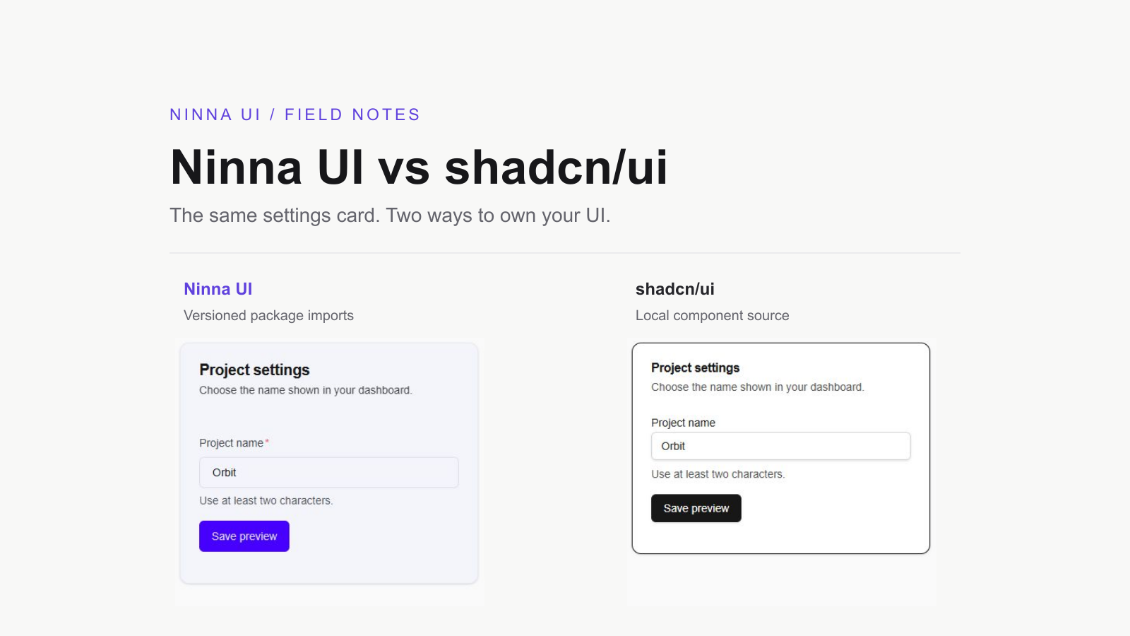
For a small SaaS dashboard, a settings form is a better component-library test than a gallery of buttons. It combines a card, a labelled input, helper text and a submit action—the pieces you will repeat across billing, workspace and account screens. Ninna UI is a strong fit when you want to build those screens from versioned React packages and keep styling in Tailwind CSS v4.
We maintain Ninna UI. This comparison was drafted with AI assistance and includes checked component examples and primary sources.
Choose the workflow you want to maintain
Choose Ninna UI if your priority is composing documented components without keeping a local implementation of each control. Card, Field, Input and Button arrive through public npm packages. A shared CSS theme gives them a consistent foundation, while props and className handle the changes a settings screen usually needs.
Choose shadcn/ui if editing the component implementation is part of your product work. Its source-distribution approach puts component files in your repository. You can change markup and behavior directly, with responsibility for keeping your local changes and dependencies maintained. That control is useful when a design system needs more than a different color, radius or spacing value.
This example compares Ninna UI 0.7.0 with an explicitly selected shadcn/ui new-york Radix registry snapshot. It does not represent every shadcn style or the latest CLI default: the current documentation also presents Base UI and React Aria options. The goal is to compare a real card/form slice and its ownership decisions, rather than declare one universal winner.
shadcn/ui: component code and current setup options
The feature: rename a project, locally
Both versions show the same “Project settings” card, start with the illustrative name Orbit, require two characters and announce a local preview result after submission. The form deliberately has no API call, authentication or persistence. In a real SaaS app, keep validation on the server too, handle failures and only announce a successful save after the server confirms it.
The cover shows the actual browser-rendered fixtures, both forced to light mode for this comparison. Different spacing and default colors are visible; this is not a performance benchmark or an accessibility certification. The fixtures were checked with React 19.2.8 and TypeScript 5.9.3.
Build the Ninna UI version
Start in an existing React/TypeScript app with Tailwind CSS v4 configured. Install the theme and the three public component packages used here:
pnpm add @ninna-ui/core@latest @ninna-ui/data-display@latest @ninna-ui/forms@latest @ninna-ui/primitives@latestAdd the required CSS imports to the app stylesheet. Set data-theme="default" on the root html element and keep the server and client root markup consistent. Leave light/dark classes unset for system color mode, or deliberately select a mode; the screenshots use class="light" to make the comparison repeatable.
@import "tailwindcss";@import "@ninna-ui/core/theme/presets/default.css";@variant dark (&:is(.dark *));The Ninna UI version uses Card.Body for content and Field to associate the label and helper text with its direct Input child. The required prop on Input enables native required validation; Field also presents the required state. Keep both when the field must be filled.
import { useState, type FormEvent } from "react";import { Card } from "@ninna-ui/data-display";import { Field, Input } from "@ninna-ui/forms";import { Button } from "@ninna-ui/primitives";
export default function NinnaSettings() {  const [message, setMessage] = useState("");  function save(event: FormEvent<HTMLFormElement>) {    event.preventDefault();    const name = String(new FormData(event.currentTarget).get("projectName") ?? "").trim();    setMessage(name.length < 2 ? "Use at least two non-space characters." : `Preview saved: ${name}.`);  }  return (    <Card className="w-full max-w-sm">      <Card.Header>        <Card.Title>Project settings</Card.Title>        <Card.Description>Choose the name shown in your dashboard.</Card.Description>      </Card.Header>      <Card.Body>        <form onSubmit={save} className="space-y-4">          <Field id="ninna-project" label="Project name" helperText="Use at least two characters." required>            <Input name="projectName" defaultValue="Orbit" required minLength={2} />          </Field>          <Button type="submit" color="primary">Save preview</Button>          <p role="status" className="text-sm">{message}</p>        </form>      </Card.Body>    </Card>  );}
The important detail is the import map: Card belongs to data-display, Field and Input to forms, and Button to primitives. You can add a settings card without moving those implementations into your own components directory. The submit handler belongs to your app and stays yours to change.
Build the shadcn/ui version
In a configured shadcn/ui project, add the corresponding controls through its CLI. Follow the current framework installation guide for Tailwind setup, import aliases and your chosen style/base; this command alone is not a complete fresh-project setup. The fixture here pins the published new-york registry files for reproducibility, rather than assuming a future CLI generates identical code.
pnpm dlx shadcn@latest add card input buttonUse your generated local import paths in an app. The checked fixture below keeps those files beside the example, so its relative paths point directly to the downloaded registry components. It uses a native label and description; shadcn also provides Field components if you prefer a reusable field abstraction.
import { useState, type FormEvent } from "react";import { Card, CardHeader, CardTitle, CardDescription, CardContent } from "./shadcn/card";import { Input } from "./shadcn/input";import { Button } from "./shadcn/button";
export default function ShadcnSettings() {  const [message, setMessage] = useState("");  function save(event: FormEvent<HTMLFormElement>) {    event.preventDefault();    const name = String(new FormData(event.currentTarget).get("projectName") ?? "").trim();    setMessage(name.length < 2 ? "Use at least two non-space characters." : `Preview saved: ${name}.`);  }  return (    <Card className="w-full max-w-sm">      <CardHeader>        <CardTitle><h3>Project settings</h3></CardTitle>        <CardDescription>Choose the name shown in your dashboard.</CardDescription>      </CardHeader>      <CardContent>        <form onSubmit={save} className="space-y-4">          <div className="space-y-2">            <label htmlFor="shadcn-project" className="text-sm font-medium">Project name</label>            <Input id="shadcn-project" name="projectName" defaultValue="Orbit" required minLength={2} aria-describedby="shadcn-help" />            <p id="shadcn-help" className="text-sm text-muted-foreground">Use at least two characters.</p>          </div>          <Button type="submit">Save preview</Button>          <p role="status" className="text-sm">{message}</p>        </form>      </CardContent>    </Card>  );}
Here CardContent holds the form. Label association and the helper-text ID are explicit in the feature code. Neither example is a complete form-validation system: native constraints handle empty and short input, and the shared submit logic rejects names made only of spaces. Both announce the preview through a status region.
What changes when the design changes?
A different card treatment
For Ninna UI, start with a supported Card variant or className. Changing the card to variant="elevated" changes its presentation through the public API. Keep the card itself non-interactive when its children already contain form controls. For the selected shadcn fixture, edit the local Card classes or pass className at the call site. A local edit can affect every screen importing that file, which is useful when you intentionally own that design decision.
A different brand color
Ninna UI’s preset and semantic tokens provide the shared starting point; this example selects color="primary" on Button. Its theming is CSS-first. That statement concerns theming, not all component behavior: the React state and submit handler still run JavaScript. shadcn/ui also documents CSS-variable theming. Choose between the workflows by where you want changes to live, rather than assuming either approach forces hardcoded colors.
shadcn/ui theming documentation
A different internal structure
If most requests can be expressed with Ninna’s documented composition, variants and CSS overrides, package imports keep your feature code focused on the product. If you routinely need to replace a control’s internal structure, shadcn’s local source is a practical advantage. Ninna UI’s tradeoff is that you work within its public API and evaluate package upgrades; shadcn’s tradeoff is that your repository owns its component modifications. Both still require dependency maintenance and testing.
A practical choice for an indie dashboard
For a Tailwind v4 dashboard with familiar cards and forms, start with Ninna UI when you want a coherent package-based foundation. This settings slice demonstrates the benefit clearly: a small set of public imports, one theme setup and feature logic that stays in the app. Choose shadcn/ui when direct implementation ownership is an explicit requirement, or your existing app already has a well-maintained local component system. A rewrite is not automatically an improvement.
Before committing to either, try your real requirements: validation errors, loading and failure states, keyboard use, small screens and the next two settings sections. This article checks a deliberately small slice; it makes no claim about bundle-size savings, time saved or full-app accessibility.
Try Ninna UI: installation and theme setup
Sources and reproducibility
The matching Ninna source, tests and playground examples were inspected. Both fixture implementations passed TypeScript and server rendering, and browser checks exercised local success and whitespace validation. The shadcn registry snapshot and its MIT notice are retained with the reproducibility files. Ninna UI is MIT-licensed too; preserve the notices for the code you reuse.